23 Jul Best Composition Tips for Macro Photography
Why is composition important for macro photography?
Composition is a very effective element to make your photo stand out or guide the viewers view.
This applies for all photography genres.
When it comes to macro photography, where we often are extremely close to our subjects, you could think composition is not as important as showing the close-up details and textures.
Actually, with composition, you can add another level of quality to your macro photos as well – even in the images with the highest of magnification.
Composition is a great tool to prevent repeated, similar motifs from looking recognizable, boring and uncreative.
With a specific technical setup it is easy to recreate a specific image theoretically – in terms of camera, lens, settings and mabe even lighting – but composition is what seperates the WOW images from the masses of technically perfect, yet visually boring images.
Let us take a look at some basic principles of composition and illustrate them with a photographic example from my archives.
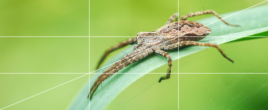
Leading lines
When we see an image, our eyes (or brain to be more specific) start to “read” it:
We recognize light and dark areas, contrasts draw our eye, we see where there are areas of focus, and concentrate on these.
At the same time the elements and forms of the depicted scene guide our eyes in the same way.

This means, we can actively guide the eye by making use of these elements.
The rule of thirds – A composition classic

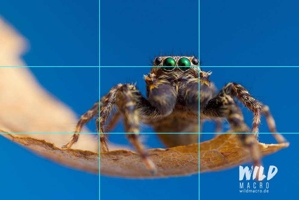
For me personally, this is the composition I use the most.
It is also a very versatile one and can implement a lot of elements of the motif or scene at the same time.
The points of interest or focus – most often the eyes – are best placed on the intersections of the compositional lines, visible after dividing the image in equally sized thirds with vertical and horizontal lines.
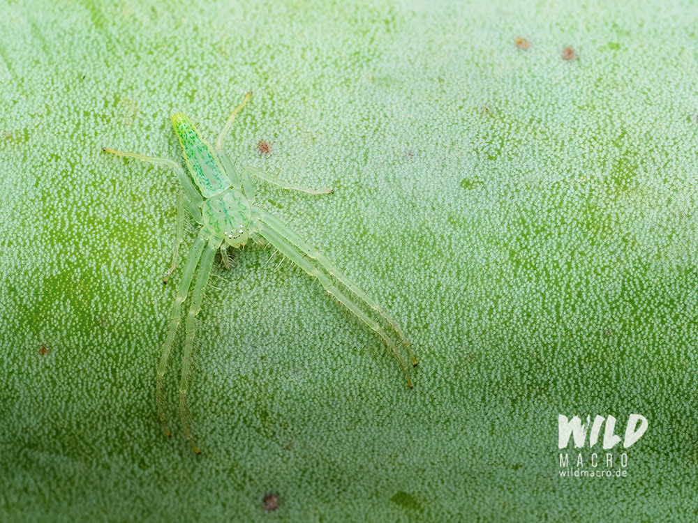
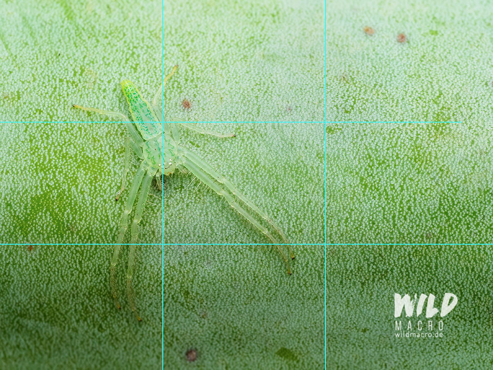
From my experience, it happens relatively often, that multiple elements of your subject can be aligned with the lines.
The Golden ratio looks similar to the classic rule of thirds: it uses a proportion of 1:1,618 and can also be translated into the so called Fibonacci spiral.


Diagonal compositions
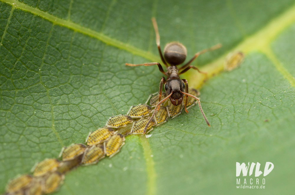

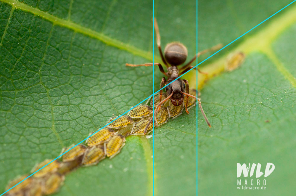

For this composition the most important guide lines are the diagonals.
Points of interest should be placed on or be aligned with the diagonals, or the elements of the image could actually form the diagonals.
If you take your time to look at your work and try to find “material” for the compositions, you will realize there are often a lot of patterns you can find.
There is a good chance that the viewer will passively and subconsciously somehow recognize these, too.
In the photos above, additionally to the diagonals, they can also be divided into thirds and others geometrical forms are present.
Centered and radial compositions
Centered or radial composition clearly guide the eye to the center of the image.
This is where “it happens” – but it does not mean that there cannot be additional elements in the other arewas of the frame.
These additional elements can even elevate and intensify the centered compositions.
Have a look at this Bark spider: it is sitting right in the center of the frame, with the legs framing its head, the point-of-interest and focus.
At the same time, the legs are forming a triangle.
The contrast of the black head area adds to the composition and draws the eye to it.
Finally, the horizontal line, created between the black background and the cryptic bark texture on the bottom, is aligned with the eyes of the spider.

Often the mix of lines or circles (like in the radial approach) or other forms, with the core subject in the center, is what makes this composition work effectively.
As a deviation, the same principles can be applied to an off centered composition as well.

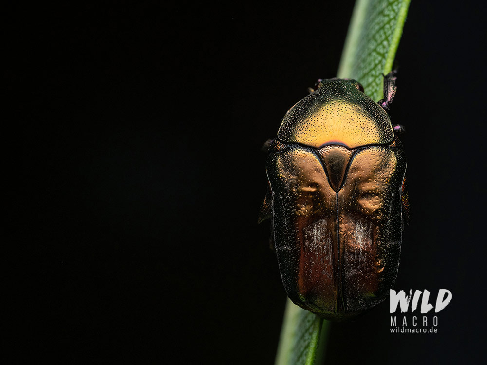
Experiment
Rules are great for guidance, just like food recipes.
But at the same time it can also fuel your creativity if you break these rules on purpose.
They can be used as a starting point and blueprint, but it is no problem to deviate.
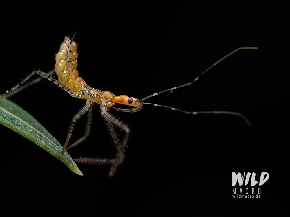
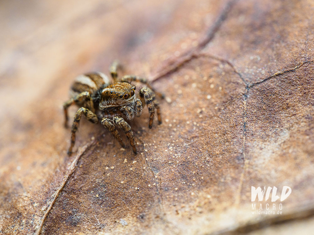
Breaking patterns creates attention and that might be just what you want for your photography – to make it stand out!


Conclusion
This is obviously just a basic selection of compositional concepts – there are a lot more – from basic ones, to extremely complex ones, like the golden ratio.
In macro photography, even at extremely short distances to your subjects, showing almost unrecognizable patterns and crops, using a compositional concept can make an otherwise boring looking photo stand out.
It adds a whole new creative and visual layer to it.
Sometimes it can already be enough to place your subject off center and add more “white space” to your image to make it more interesting.
Instead of taking the perfect super deep focus stack for the 100th time, try to improve on that with a composition instead.
You will see quickly, how much more you (and others) will enjoy the photo.
Sign up for the newsletter mailing list & free ebook

Did you enjoy these tips and want to learn more or improve your macro photography skills?
Stay up to date with new blog posts, reviews and tutorial- and ebook-releases.
Sign up below to get notified when the free edition of my ebook
‘How to master spider & insect macro photography’ is ready for download.


Brendan James
Posted at 14:30h, 24 Julygreat work Chris! very informative and lovely shots
wildmacro-chris
Posted at 15:16h, 24 JulyThanks a lot Brendan, I appreciate you commenting here, glad you enjoyed the read.